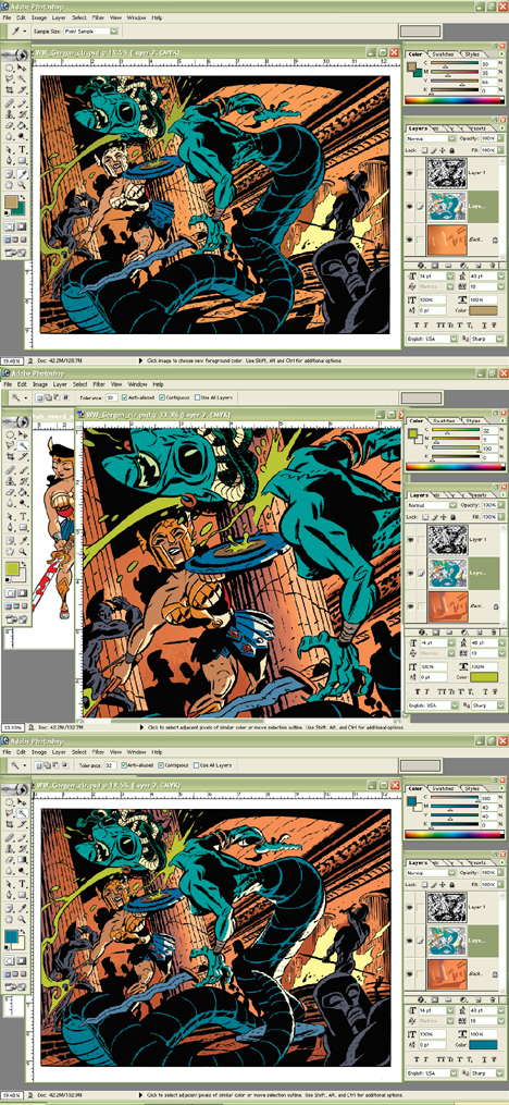
Before I begin let's assume you've created a piece of black and white line art and that you are passingly familiar with all that Photoshop has to offer (I'm using Photoshop 7.0) That is, you know how to create layers, choose different brushes, and save your files regularly. I also use a lot of the key-command shortcuts but will do my best to give the menu directions. And, yes, I'm on a PC. Let's not make this a discussion about the marvelousness of Macs, shall we :)
If it lends any credibility to my colouring methodology I learned most of my techniques from the following top talents: Laura Allred (Madman, X-Statix), Darwyn Cooke (New Frontier, Catwoman), and Laura DePuy (Authority).
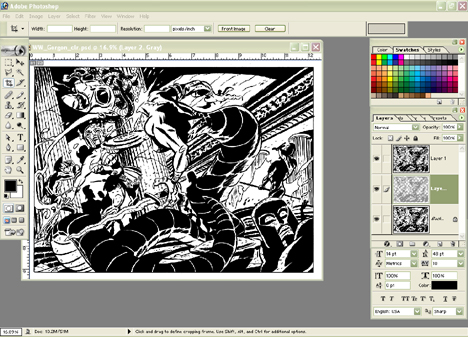 Step 1 - Scan your black and white lineart. Convert to Greyscale by going to IMAGE - MODE - GRAYSCALE. With default colours set on black (foreground) and white (background) go to SELECT - COLOR RANGE. A pop-up window gives you selection options. Black is automatically selected as the default sampled colour, and your FUZZINESS should be at the far right (which for me is 200).
Click OK and now you've got marching ants 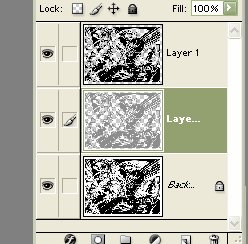 around all of your black areas. Without deselecting your art create a new layer by clicking the NEW LAYER icon in your LAYERS PALETTE. Fill your selection with black by going to EDIT - FILL and choosing your foreground colour (PC shortcut is Alt-Delete). Don't deselect just yet. Go back up to SELECT menu and choose MODIFY - CONTRACT. Contract your selection by one pixel, create another new layer and fill that layer selection with a colour you won't likely use in your art. I chose a medium grey. Now you've got three layers; your original background lineart, lineart in grey (or chosen colour) and top layer of black and white lineart.
 around all of your black areas. Without deselecting your art create a new layer by clicking the NEW LAYER icon in your LAYERS PALETTE. Fill your selection with black by going to EDIT - FILL and choosing your foreground colour (PC shortcut is Alt-Delete). Don't deselect just yet. Go back up to SELECT menu and choose MODIFY - CONTRACT. Contract your selection by one pixel, create another new layer and fill that layer selection with a colour you won't likely use in your art. I chose a medium grey. Now you've got three layers; your original background lineart, lineart in grey (or chosen colour) and top layer of black and white lineart.
 Why do I create another layer? This is the layer I am going to do most of my colouring on and with lineart one pixel smaller than the black and white lineart I can select areas for easier filling (where lines are closed).
SAVE your file giving it a wonderfully creative name.
Below is a close up of my artwork by layer. The grey lineart and black and white lineart. Remember not to touch your black and white top layer...you can lock it if you're prone to layer hopping. There's a LOCK icon in your LAYER PALETTE, just click it with your lineart layer selected.
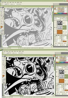
Step 2 - Convert your file to CMYK (IMAGE - MODE - CMYK). It's the colour mode you'll need to be in for printing with every printer and it's much easier to convert to RGB for Internet posting than to do a backwards conversion for colour printer output. 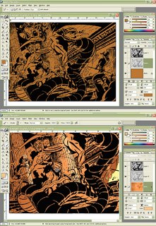

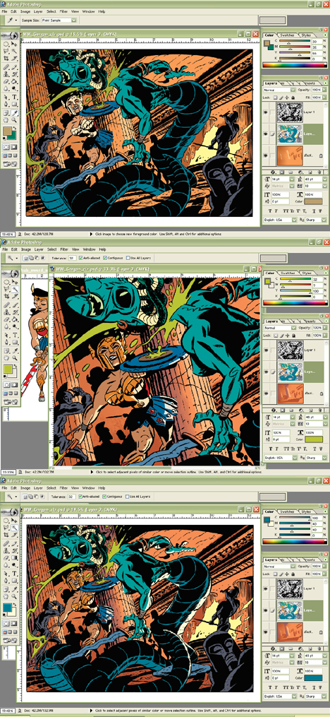
Now comes the fun part! COLOUR! I usually start by making my background layer a solid filled colour. I chose brown because I know I want a reddish colour as my background. There's a fire in my background art which is going to make the setting red and also I know I'm going to colour the Gorgon greenish and I want her to stand out from the background.
I coloured the fire next and suggested a few places I might highlight with light from the fire. I colour with brushes, the POLYGONAL LASSO TOOL (allowing me to create selected areas with continous clicks), MAGIC WAND tool and my shortcut fill command. All of this is done on the background layer because I like to save my grey lineart layer for characters. This way I can change my background colour art anytime without having to carefully select around my character colour art. Make sense?
SAVE as you go.
Hot Tip - I highly recommend learning all of the shortcut key commands
for your favourite tools just to save you time.
for your favourite tools just to save you time.
When colouring I usually try to colour what I know...ie Wonder Woman's skin tone costume. I know that the Gorgon is going to be green-blue so I colour all of her skin. I don't bother with highlights or shadows yet, just flat colour values.
I already have a colour image of Wonder Woman so I actually opened up that file and used the EYEDROP tool to choose her colours.
Hot Tip - I create shadow and highlight colours by altering the COLOR sliders in the COLOR PALETTE. Beside each slider is a number value. I change those values by adding or subtracting 20-30 to my current value. For example: Wonder Woman's skin tone in CMYK is C- 12 M- 46 Y- 62 K- 0 . For a highlight I change the number values to read C- 0 M- 16 Y- 32 K- 0 .
I was always told not to use black in your colour. It's a good rule for painting and equally good for computer colour. Black tends to dull your values and dull colour is not desireable!
Once I've got all my colour areas filled in I start highlighting or shadowing using my light source (the fire) as a guide. Using the MAGIC WAND I'll select a colour area, fill it with a more appropriate colour...say a highlight...then with my brush tool I'll cut in shapes of darker colour. My current technique is to use the solid brush as a circle and increase or decrease its size until it fits exactly the shape I want for my darker colour area.
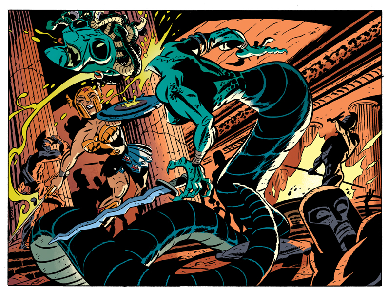
And that's it! Honest. I usually end up adjusting colours once I'm done. The background of the final image was lightened by using the IMAGE - ADJUSTMENTS - HUE/SATURATION sliders. I use that pretty regularly when I'm not sure of a colour choice. It's a nice quick way to play around with colours without having to hit UNDO after every change.
A final Cool Tip - CTRL H hides the marching ants around a selected area. I use that a lot because I find the "ants" distracting when colouring. And here's the final image. I hope the tutorial was helpful to those of you who asked for it! Feel free to ask questions if anythings not clear or if you want further explanation. This is already a long post so I'll save the halftone screen explanation for another day.
Hot Tip - I create shadow and highlight colours by altering the COLOR sliders in the COLOR PALETTE. Beside each slider is a number value. I change those values by adding or subtracting 20-30 to my current value. For example: Wonder Woman's skin tone in CMYK is C- 12 M- 46 Y- 62 K- 0 . For a highlight I change the number values to read C- 0 M- 16 Y- 32 K- 0 .
I was always told not to use black in your colour. It's a good rule for painting and equally good for computer colour. Black tends to dull your values and dull colour is not desireable!
Once I've got all my colour areas filled in I start highlighting or shadowing using my light source (the fire) as a guide. Using the MAGIC WAND I'll select a colour area, fill it with a more appropriate colour...say a highlight...then with my brush tool I'll cut in shapes of darker colour. My current technique is to use the solid brush as a circle and increase or decrease its size until it fits exactly the shape I want for my darker colour area.
And that's it! Honest. I usually end up adjusting colours once I'm done. The background of the final image was lightened by using the IMAGE - ADJUSTMENTS - HUE/SATURATION sliders. I use that pretty regularly when I'm not sure of a colour choice. It's a nice quick way to play around with colours without having to hit UNDO after every change.
A final Cool Tip - CTRL H hides the marching ants around a selected area. I use that a lot because I find the "ants" distracting when colouring. And here's the final image. I hope the tutorial was helpful to those of you who asked for it! Feel free to ask questions if anythings not clear or if you want further explanation. This is already a long post so I'll save the halftone screen explanation for another day.
j.


 best,
best,













 Okay, now that you're awake, I should explain who these characters are...that's Brian as a Dr.Strange occult-type hyp-motizing you...and then there's me as an almost invisible grey ghost-type. Brian wrote the fun board game in the March Issue of Owl magazine and I drew it. There's also some terrific artwork by Michael Cho and Claude Bordeleau! Check it all out!