Wednesday, December 20, 2006

Happy Holidays!

My Christmas card this year! I have many fond memories of waking up Christmas morning and running downstairs to see what Santasquatch left for me under the tree. His pungent odor still hung in the air as I tore into my gifts. It was always my intent to climb up to the roof and make a plaster-of-paris cast of Santasquatch's enormous footprint left in the rooftop snow...but dad wouldn't let me use the ladder. And although my image here shows cookies and milk in the foreground, Santasquatch actually prefers raw meat and birds eggs. *sigh* Oh, memories!


And here's the birth of Santasquatch. As you can see, when I originally drew him he was called Sant-Sasquatch. Drawn for Milo who also got the Puck drawing I did a few comic conventions ago.

hugs all,

j.

Thursday, December 14, 2006

Blueline Inking.

Aloha, friends. Who wants some cheesecake? I'm serving up a slice disguised as a quick tutorial on inking over a blueline printout. As with the colouring tutorial this is merely one man's method and there are many ways to work. Here's mine...

The first step is a pencil drawing. After Prismacolor changed their lead to a crappier, gritty formula I switched back to drawing with regular old grade school HBs. I use a Papermate HB #2 (sometimes #3 which is a little harder lead). I draw my roughs on photo-copy paper relatively loosely. Above is a section of my actual rough artwork. I scan the grey line art on the GRAYSCALE setting. My scanning sometimes doesn't pick up really light lines and I found that if there is something solid black on the scanner with my drawing more lines are "read". My solution - a post-it note with "SCAN!" written in thick black marker. I stick it on pencil drawings and they scans perfect every time. Just remember to delete the post-it in Photoshop.
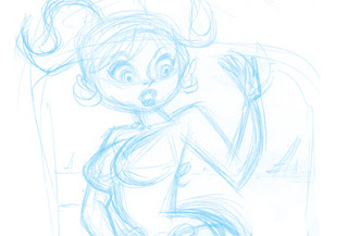
Step two-ish is to convert your grey line to blue. I used to do it in a really complicated way which I won't tell you here (so as not to confuse and also because I can't believe I used to do it any other way). The easiest way to convert your art to blue, or 100%CYAN, is as follows: With your greyscale file open SELECT ALL and COPY your image. DELETE it. That's right. DELETE it. You need a clean background for the next step (you could also have a second window open if you're nervous about losing your artwork for ever). Convert your file to CMYK. Select the CHANNELS pallette (it's in with LAYERS, HISTORY, etc...) and highlight the CYAN CHANNEL.
PASTE your artwork into the CYAN CHANNEL.

Return to your LAYERS palette. Your art probably still looks grey, which is why you now create a DUPLICATE LAYER of the background.

Did it just show up blue? Awesome. Delete the background layer and you've got a perfectly 100% Cyan image that, when inked, won't scan.My next step (step three) is to tighten the pencils. I LOVE pencilling over a blueline that won't erase or disappear no matter how much I abuse my paper. Okay, I can't spill coffee on it or call it degrading names but it's pretty near un-removable. You may not want to print out at 100%...instead you can reduce the opacity of your Cyan layer to 15-30%. It's a little easier to draw over your rough if the blueline isn't overpowering your senses.

I realize that I still erase my pencils after I've inked the image which you might think defeats the purpose of printing the blue. Well, I still have that crutch but the better artists among you can ink right over your blue art with nary an HB coming near the page. I ink all of the Spirit pages like that...Darwyn's pencils converted to blueline at about 30% opacity so I can still make out all the details. It's a beautiful way to work.
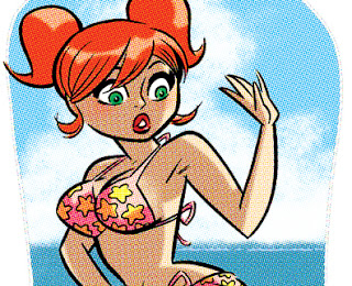
When you scan the black and white art for colouring make sure that your scanner is set on LINEART or BLACK AND WHITE (whatever your scanner setting is) and the blue will not scan.
Incidentally, the above image is not ready to be seen in full yet. But you don't need to see the whole thing for a tutorial, do you? :)
Also, I don't foresee doing an inking tutorial at any time. Instead I'm going to recommend getting Gary Martin's book THE ART OF COMIC BOOK INKING. I searched for it at Amazon and apparently only Volume 2 is available. I have never seen Volume 2 and heard it isn't nearly as good or informative as volume 1. If you have used bookstores near you I suggest starting there.
My only other suggestion is to get your hands on as many pages of pencilled comic art (online, from friends, scans from the Kirby collector, etc...) as you can and start there. Hey, you can even print out blue line copies of the art so if you muck it up make another print out and start over. Easy peasy!
Happy drawing!
j.

Wednesday, November 29, 2006

Wonder Woman Pencils!

This may seem awfully backwards but after last post's detailed description of colouring I thought I was asked to create an equally detailed article on inking. I won't be doing that today! :)
But what I will do is show my roughs and the final pencils.
These were drawn fairly small...about 5.5" by 4" in pencil first and then loosely inked. I had several variations on poses and composition, chose these two as my favourite and scanned them in. Finally choosing the bottom drawing as the better of the two I re-sized the image for 9"x12" paper and printed it out in blue line.
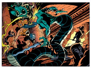
Then I just started pencilling. You can kinda make out some of the blue line under my grey pencil. This method has saved me so much drawing time in that if you make a mistake or don't like something you've done you can erase the pencil and your blue print-out is still underneath. The keen among you might notice that some of the statues changed in the inking stage and a completely new one springs up behind Wonder Woman's sword. Speaking of swords...I embiggened the Gorgon's sword before inking, as well.

Tools - I draw with a regular old HB pencil (Papermate Mirado Classic #3) on Strathmore Bristol Vellum finish.

j.

Monday, November 20, 2006

Colouring Tutorial!

Here in all it's explanatory glory is a colouring tutorial and should, if I do well in my job, give away all of my secrets! I only hope I am up to the task.

Before I begin let's assume you've created a piece of black and white line art and that you are passingly familiar with all that Photoshop has to offer (I'm using Photoshop 7.0) That is, you know how to create layers, choose different brushes, and save your files regularly. I also use a lot of the key-command shortcuts but will do my best to give the menu directions. And, yes, I'm on a PC. Let's not make this a discussion about the marvelousness of Macs, shall we :)

If it lends any credibility to my colouring methodology I learned most of my techniques from the following top talents: Laura Allred (Madman, X-Statix), Darwyn Cooke (New Frontier, Catwoman), and Laura DePuy (Authority).

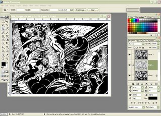
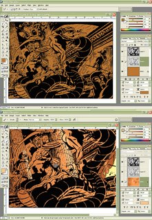
Step 1 - Scan your black and white lineart. Convert to Greyscale by going to IMAGE - MODE - GRAYSCALE. With default colours set on black (foreground) and white (background) go to SELECT - COLOR RANGE. A pop-up window gives you selection options. Black is automatically selected as the default sampled colour, and your FUZZINESS should be at the far right (which for me is 200).


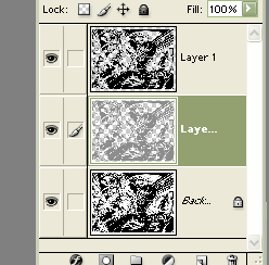
Click OK and now you've got marching ants around all of your black areas. Without deselecting your art create a new layer by clicking the NEW LAYER icon in your LAYERS PALETTE. Fill your selection with black by going to EDIT - FILL and choosing your foreground colour (PC shortcut is Alt-Delete). Don't deselect just yet. Go back up to SELECT menu and choose MODIFY - CONTRACT. Contract your selection by one pixel, create another new layer and fill that layer selection with a colour you won't likely use in your art. I chose a medium grey. Now you've got three layers; your original background lineart, lineart in grey (or chosen colour) and top layer of black and white lineart.


Why do I create another layer? This is the layer I am going to do most of my colouring on and with lineart one pixel smaller than the black and white lineart I can select areas for easier filling (where lines are closed).

SAVE your file giving it a wonderfully creative name.

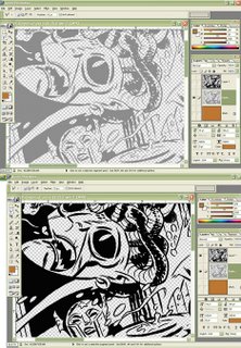
Below is a close up of my artwork by layer. The grey lineart and black and white lineart. Remember not to touch your black and white top layer...you can lock it if you're prone to layer hopping. There's a LOCK icon in your LAYER PALETTE, just click it with your lineart layer selected.


Step 2 - Convert your file to CMYK (IMAGE - MODE - CMYK). It's the colour mode you'll need to be in for printing with every printer and it's much easier to convert to RGB for Internet posting than to do a backwards conversion for colour printer output.

Now comes the fun part! COLOUR! I usually start by making my background layer a solid filled colour. I chose brown because I know I want a reddish colour as my background. There's a fire in my background art which is going to make the setting red and also I know I'm going to colour the Gorgon greenish and I want her to stand out from the background.


I coloured the fire next and suggested a few places I might highlight with light from the fire. I colour with brushes, the POLYGONAL LASSO TOOL (allowing me to create selected areas with continous clicks), MAGIC WAND tool and my shortcut fill command. All of this is done on the background layer because I like to save my grey lineart layer for characters. This way I can change my background colour art anytime without having to carefully select around my character colour art. Make sense?

SAVE as you go.

Hot Tip - I highly recommend learning all of the shortcut key commands
for your favourite tools just to save you time.

When colouring I usually try to colour what I know...ie Wonder Woman's skin tone costume. I know that the Gorgon is going to be green-blue so I colour all of her skin. I don't bother with highlights or shadows yet, just flat colour values.

I already have a colour image of Wonder Woman so I actually opened up that file and used the EYEDROP tool to choose her colours.

Hot Tip - I create shadow and highlight colours by altering the COLOR sliders in the COLOR PALETTE. Beside each slider is a number value. I change those values by adding or subtracting 20-30 to my current value. For example: Wonder Woman's skin tone in CMYK is C- 12 M- 46 Y- 62 K- 0 . For a highlight I change the number values to read C- 0 M- 16 Y- 32 K- 0 .

I was always told not to use black in your colour. It's a good rule for painting and equally good for computer colour. Black tends to dull your values and dull colour is not desireable!

Once I've got all my colour areas filled in I start highlighting or shadowing using my light source (the fire) as a guide. Using the MAGIC WAND I'll select a colour area, fill it with a more appropriate colour...say a highlight...then with my brush tool I'll cut in shapes of darker colour. My current technique is to use the solid brush as a circle and increase or decrease its size until it fits exactly the shape I want for my darker colour area.

And that's it! Honest. I usually end up adjusting colours once I'm done. The background of the final image was lightened by using the IMAGE - ADJUSTMENTS - HUE/SATURATION sliders. I use that pretty regularly when I'm not sure of a colour choice. It's a nice quick way to play around with colours without having to hit UNDO after every change.

A final Cool Tip - CTRL H hides the marching ants around a selected area. I use that a lot because I find the "ants" distracting when colouring. And here's the final image. I hope the tutorial was helpful to those of you who asked for it! Feel free to ask questions if anythings not clear or if you want further explanation. This is already a long post so I'll save the halftone screen explanation for another day.

j.

Monday, November 06, 2006

Sweet Cupcake!


Ah, how I am loving to draw Wonder Woman! She is just so perfect and wonderful in her satin tights, fighting for our rights and the old red, white and blue!
This was drawn and printed out for a birthday card! Happy Birthday!
j.

Tuesday, October 31, 2006

Aquaman!

First of all HAPPY HALLOWEEN everyone! Halloween is actually my favourite out of all the holidays. I love all the monster movies on TV, giving out candy, and especially costumes. I love the dress up!

All of my Halloween loving does nothing to explain todays post. Why am I putting up a picture of Aquaman? Sure, his costume is the colour of a pumpkin but is that any good reason? I say it is. So, in light of the fact that I don't have any other suitable Halloween images I give you Aquaman on monitor duty in glorious orange and green!! Also, here is a picture of my dog and his new favourite chew toy. :)
best,
j.
p.s. Incidentally, I switched my blog to the new beta set up. What that means for bookmarks and such I don't know...we'll find out soon enough.

Thursday, October 19, 2006

Savage Sword of Wonder Woman!

Here's a slightly more serious take on last post's cartoony version of Wonder Woman! The costuming here is based on Diana's warrior garb from Darwyn Cooke's New Frontier! Before the book even came out there was much discussion about Wonder Woman's weight...which is (in a roundabout way, no pun intended) where my recent drawings are coming from. I like the thought of Wonder Woman as a husky gal. One who eats and drinks, has some meat on her bones and who loves a good fight!
And I much prefer the beefy gal as opposed to the skinny-minny she's become in recent issues of certain DC comics OR the muscled super-woman she is as drawn by certain artists. Actually I'm really enjoying the recent version of Wonder Woman as drawn by Terry and Rachel Dodson. They're sort of doing a Lynda Carter which is ALWAYS okay with me!

Ever yours,

j.

Saturday, October 14, 2006

WOTTA WOMAN!!

I believe I will let this post run without much commentary from me. I could go on for hours about my love of Wonder Woman, how my focus is mostly on the memory of the Lynda Carter tv series and not at all any of the comic books (because I don't care much for how she's been done in comics). I could address the plumpness of my drawing and the heaviness of her bosom. I could say something about the odd little graphic thing beside her. But I won't do any of those things because it's dinner time and I'm hungry.

j.

Monday, October 09, 2006

Universal Horror!

Today's entry is one of my favourite projects from my college years. The assignment was to choose a topic and create four illustrations -- one each in the styles of two illustrators and two fine artists. I think I'd just recently seen a bunch of the Universal films and most definitely was already in love with the Invisible Man and the Creature from the Black Lagoon. So my topic was the Universal Horror monsters. And because I loved comics I opted for two comic book artists as my illustrators.
Mike Mignola, the creator of Hellboy, had just worked on the Dracula movie adaptation (based on the Coppola movie...I own a page of his art from that series). The Invisible Man is my attempt at Mignola's style rendered in goauche. I really wanted to re-create the scene of the Invisible Man standing in front of the window in his rented room. Una O'Connor is fussing around him, procrastinating so she can get a better look at him. At the time I lacked the ability to work out the perspective properly to really do the scene right.
Frankentstein's monster is done through the style of Egon Schiele (the white outline and hand touching himself are two things I took from Schiele). I don't think the face on the monster turned out all that well but even years later I love how the hand looks. Look up Egon Schiele to see some real art!
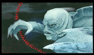
Bill Sienkiewicz (no, I didn't look up the spelling) illustrated a comic book version of Moby Dick. It has lots of gorgeous water colour painting and underwater ghostly images of the Whale. I wanted my Creature to look like Bill's paintings but lacked the ability to really paint in water colour.

The Bride of the Monster is done in the style (and I think directly ripped off composition) of a Gustav Klimt painting. All that gold and the pose of the Monster are definitely Klimt. In a way this is also another Mike Mignola piece because Mike used the same Klimt painting I based this on in a page of Ironwolf.

Halloween's coming up quick...hope you've all got your costumes worked out. I know I haven't.

best,
j.

Saturday, September 16, 2006

Baby Face!

I love Harvey comics especially Hot Stuff the Little Devil and Spooky (Casper's tough cousin...he's the ghost what wears a 'doiby'). Those cute little characters were on my mind as I was working on this drawing...which is why it a)Looks kinda like a comic book cover and 2) has that silly little clown above the price. I figured I couldn't and shouldn't just draw the Harvey clown which was on the covers of Spooky and Hot Stuff so I created this little guy. He's got a hobo beard and hat which started as a derby and ended up more like a sombrero with a pom-pom.


Noah is about 8 months old by now and is the son of a friend visiting from New Zealand. She'd asked me to draw a picture of him. Which I would have done anyway because he's a funny little guy with a giant head of hair. But I was torn...did Noah's mom want a portrait (traditional shading on textured paper)?

I don't really do "portrait" art so I figured comic book inking was the way to go. I think she liked it.

j.

Tuesday, September 05, 2006

The Creature from the Black Lagoon!

The Creature from the Black Lagoon is my favourite of the Universal Horror Monsters! The monster looks great! There's a terrific scene where Julie Adams is swimming and the creature is beneath her also swimming in an almost mirror image of her (if the mirror in question was a distorting mirror that turned you into an underwater creature of the opposite sex).

The movie was originally made to play in 3-D which is why the second image has that sort of off centre red behind the black out line. Watching an old 3-D movies without the glasses actually hurts the muscles of my eyes and makes me want to almost throw up. Please don't throw up when you look at my drawing of the Creature from the Black Lagoon!!

There are two sequels to the Creature from the Black Lagoon. Revenge of the Creature stars John Agar who was married to Shirley Temple for a while. There is also a lab scene with a young Clint Eastwood as a lab technician (Eastwood also appears in another movie by Creature director Jack Arnold...The Tarantula. Clint is the pilot at the very end of the film who blows up the mutant arachnid).

The Creature Walks Among Us isn't my favourite of the Creature movies but it does have some stuff I like. Scientists decide to operate on the Creature to make him more human which is one of my favourite sci-fi plots (I think it's sometimes called Pinnocchio syndrome...a conceit of man's that everyone and everything wants to be just like him). There's a real heartbreaking ending to the Creature Walks Among Us because of the arrogant scientific manipulation. And there's a well done plot about an abusive relationship between a married couple.

Check those movies out if you haven't already seen them.

j.

p.s. Ben Chapman, who was in the Creature costume for land sequences in the first film, was at a Comic book and Sci-Fi/Horror convention here in town recently. I watched him signing some stuff but didn't meet him. I didn't really know what to say to him.

Sunday, August 27, 2006

Marrina!

Here, finally, is the missing member of Alpha Flight! I didn't include Marrina in my original drawing of Alpha Flight because by issue number two she'd left the team (after gutting Puck!) Sure, she provided the jet of water that defeated the giant earth elemental in issue number one but then she went and RIPPED PUCK'S GUTS OUT!!

Alpha Flight fan and avid swimmer Steve Manale pointed out my omission, and was not the only one to do so. For the Alpha Fans, especially those who love that underwater alien, here in all her gut ripping glory is Marrina.

j.
p.s. For those who may not know, that is Puck spinning on the end of Marrina's finger. It seems she can't stop herself from twisting his innards!

Wednesday, August 23, 2006

Puck!


Today's brief entry is a convention drawing I did of Puck, from Alpha Flight (see previous post). This is one of the best convention sketches I have ever done. Probably because Puck is fun to draw, but also because the guy I was drawing for, Milo, was friendly and jokey!
We joked about artists not usually drawing backgrounds on their convention sketches which is why Puck is happily bouncing through a detailed backdrop of trees and rocks. I commented that Puck was apparently always in pain because of his dwarfism. I had never heard that little people experience regular pain from their condition. I always thought of Puck as a fun character with a happy spirit. If he's in pain he hides it well. That is why he smiles as he says "Ow!".
I think Puck's legs are probably too long in this drawing which will upset Steve but it's too late to change it now.
j.

Monday, July 24, 2006

Alpha Flight!

Todays entry is in part inspired by Jay Stephens' contribution to Project Rooftop! I love that Jay made the Shaman into more of an Indian totem than just a man in tights. Very cool!

I've been wanting to draw Alpha Flight in an animated-ey style for a few months now...in fact it's been on my "To Do" list since December of last year! That drawing of Jay's was just the kick in the seat of the pants that I needed to get something done. This is not a re-design in the vein of Project Rooftop...although I am thinking it'd be fun.

Naturally, I've been re-reading all of my Alpha Flights since I started drawing this...and it struck me as odd that John Byrne spent TEN whole issues establishing the individual character's in their own issues as well as back-up stories before he got them together as a team just to KILL one of them (I won't say who because there may yet be a "new reader" out there :)

Yes, they teamed up in the very first issue and were still sort of together by issue two...but the stories quickly turned into non-team comics. Not that I mind, actually. I think if I'd been a reader back when the issues had come out I'd have probably skipped the issues with Northstar and Aurora...too much talking! I LOVE the two issues with Sasquatch fighting the Super Skrull! I think Byrne must have loved that Super Skrull because he used him again to re-vive Iron Fist in the pages of Namor!

I'll sign off now before this becomes a comic book review blog!

best,
j.

Wednesday, July 19, 2006

DCU!

Here's some work that I wish I could have done more with (and maybe there's still a chance...but I doubt it). My buddy Brian and I worked up a pitch for DC called DC University! All of the DC heroes would appear in their civilian identities, would have their powers but wouldn't be "Wonder Woman" or "Superman" as we know them now. Definitely NOT in continuity! :)
This was my Diana Prince on moving day! I imagine she drove up in her invisible hybrid!

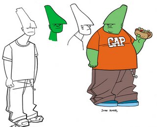
John Jones (aka The Martian Manhunter) was imagined as a husky lad! I don't remember why, really...I think the idea was that he'd come to Earth and fallen in love with pop culture, junk food and television and just got a little soft around the middle. It would be a few years before he realized his shape shifting abilities could do away with that extra weight in seconds. Much faster than the ab-sizer or the sauna belt!
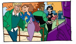
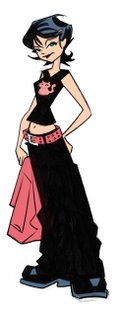
Oliver Queen (Green Arrow)...um whatever the Black Canary's real name is, John Stewart (Green Lantern) formed a sort of love triangle. John secretly had a thing for Canary who was going steady with Ollie. The girl in the black T is Selina Kyle!
Darwyn Cooke had just redesigned a new Selina Kyle and I clearly used his haircut for her in my version. Typically dressed in black I thought it would be cute that she accents with pink since she's the least likely to be a girly-girl!

I wonder if re-designs have to be attributed to the proper copyright? In any case the names all belong to DC comics and its Time Warner conglomerate!

j.

Monday, June 26, 2006

Eat an apple Every Day!

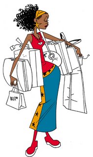
Today's illustration is brought to you by the letter J and the number 8.

Well, work is still progressing on the Superhero pitch...as is usual with those type of things the characters have changed and the approach is somewhat different. But it's all going well and I can't wait to get started on the actual pages of art.

Happy Summer, everyone!! Hope you're all staying cool and awesome!

j.

Friday, May 19, 2006

Superheroes!

You've seen these heroes before on this very blog although the Golden Owl was then green. Well, I thought they were some pretty cool looking characters and really wanted to develop them into something more. I don't want to jinx anything but it turns out other parties also think they're cool.

Cool.

So I created secret identities and relationships for the characters. They're not a superteam, just a group of hereos who all work in the same city. I won't say too much more about them but I'll tell you that the Golden Owl is a comic book artist by day (or by night depending on deadline).

peace,
j.

Tuesday, May 02, 2006

ARTCADE!

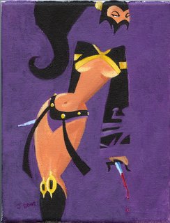
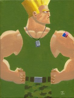
Hey there! In the exact same month, in fact the exact same week, as the Speakeasy show I was also part of the gallery exhibition currently still running...Artcade. The theme is video games and since I know very few games (I like Sims) I asked curator Brian McLachlan to send me jpegs of cute video game girls. I painted little pin-up portraits of the ones I liked and that is what I have on display at Micropolay 632 Queen st. W. Toronto. The show runs until May 17, so there's still time to check it out if you're in the hood.

My personal favourite is the girl with the blades...Mileena from Mortal Kombat.
There is also some fantastic art by the other guys listed on this flyer.
j.

Thursday, April 20, 2006

T-Shirts!

A few weeks back I was part of an art show at the Gladstone here in sunny Toronto. The theme was Comic Books but I didn't want to just put up a bunch of pages of comic art...no, sirree! I ironed up a bunch of t-shirts using some of my most recent images. The picture to the right is how my wall space turned out. Quick to put up, quick to take down.

The second picture (thanks, Chris) is a close up of one of the shirts. I ended up selling five of the shirts which was really cool! Wonder Woman was bought up by the lovely Diana Tamblyn. Thanks, Diana.

In a week I'll be a guest of the Paradise Comic Con where I plan to have more shirts printed up for sale. The coolest thing? The shirt with the Owl (my own character) actually had a lot of fans and was most requested in larger sizes. Awesome!

Tuesday, March 28, 2006

Musical Interlude!

This little piece is for the children's text book company for whom I continue to do work. Man, I really like doing work for them. The spots are simple but they give me a chance to play around with characters in fun little situations.
I loosely based the girl on the old Rankin and Bass Pinocchio character from the tv series. This jpeg is the only one I could find online. It was a stop-motion animated show I used to watch as a kid. I loved it.

As often happens after I've done a drawing I start thinking that I "swiped" the characters from somewhere. So I did a little search through my computer files and there in my Steve Lambe folder was a cute little tyke with parted hair and pony tails. Darnit! Steve's art is far superior to my own and I often look through that folder when I want to be inspired. Which is how I ended up creating something so like his. For the final piece I'm gonna change things up a bit so I'm not embarassing myself by being a copycat!

Sorry Steve! Please don't sue...!!

j.


Wednesday, March 08, 2006

Mawwiage! That sacwed institution!


A country wedding? Sounds lovely, doesn't it? This here is my drawing for my sister's summer wedding.
As you can see the happy couple are fans of ATVs. I think my recent work for children's publications is affecting my thinking...I couldn't responsibly draw the family without safety helmets AND eye protection! I also opted to place my nieces on their own vehicle even though it was funnier in the rough sketch to have them hanging onto the back of the main ATV and, sort of, flying through the air.

Apparently I have no qualms about putting a dog in harms way, mind you. Hey, if the dog wants to sit up front that's his choice. He's a grown dog, after all.
(Honestly, I love dogs. Don't sick the SPCCA on me...that's the Society for the Prevention of Cartoon Cruelty to Animals! Natch!)

j.

Sunday, February 26, 2006

You Are Under My Spell!


Yesss...yesss! You will buy the March issue of Owl magazine...you will take it home and read the stories...you will play the awesome board game with a friend or family member...you will not cry if you lose the game...you will not gloat if you win...if you have time you will write a letter to Owl magazine praising the awesomeness of the board game...you will suggest they create stories about the very cool Owl Man character and his amazing friends, Ms. Frost and Splat!...that is all...at the count of 5 you will awake and remember nothing except how awesome the artwork is in the March Issue of Owl magazine!

1...2...3...4...5!

Okay, now that you're awake, I should explain who these characters are...that's Brian as a Dr.Strange occult-type hyp-motizing you...and then there's me as an almost invisible grey ghost-type. Brian wrote the fun board game in the March Issue of Owl magazine and I drew it. There's also some terrific artwork by Michael Cho and Claude Bordeleau! Check it all out!

your pal,

SUPER J.!

Tuesday, February 14, 2006

Monday, February 06, 2006

Super Gambler!

Leaping straight from the pages of Owl magazine comes this trio of tireless do-gooders! The Owl! Jill Frost (aka The Frigid Heiress)! and Splat!

See them conquer juvenile delinquency with but a roll of the dice! Hold onto your hat as you are taken on an adventure in which the very history of the comic book universe hangs in the balance! Seek out, if you dare, the special Comic Book issue of Owl Magazine available at your local Canadian book retailer!

It's the March issue in case you were wondering!

Excelsior!
j.bone
p.s. The image depicted here does not represent the actual cover of the March issue of Owl nor is the Owl's costume coloured correctly for reasons of my own!